Change Card
The first lifestyle fashion product by a financial institution
Role: Brand Creative + Marketing Strategist
I worked on a team known internally at Capital One as the Design Pirates in 2015. The project consisted of a hardware & software product that would transform the way people connect with their money. I developed a range of packaging, designed the logomark (provided art direction for the type), outlined a strategic approach for partnerships, and put together concepts for web & in-store.
The team consisted of…
We focused on the customer segment characterized by people who:
Have the eventual, but not immediate, ability to reach long term goals
Make financial decisions on emotion and intuition
Value customization and authenticity
Have malleable financial behaviors they are actively looking to improve
Driving Insights
We strive to share success with our customers by re-imagining the way they can relate to their personal finances. We stand for the encouragement of financial confidence, individual engagement, and empowerment of our end consumers.
Financial illiteracy creates a need to educate people to spend and save wisely
Technology provides the opportunity for customers to better track their behavior
It's not about how much customers make or where they've spent their money, it's understanding why the customer behaves the way they do
UX Researchers
We took a human centered approach to understanding our target audience and some of their day to day challenges with personal finances through design thinking workshops and ethnographic interviews.
Visual Designers
Crafting an approachable aesthetic that personifies the product & simultaneously empowers the user at every level of engagement.
ID + Software teams
The card enables users to express themselves through lifestyle focused financial hardware thats paired with an innovative companion app.
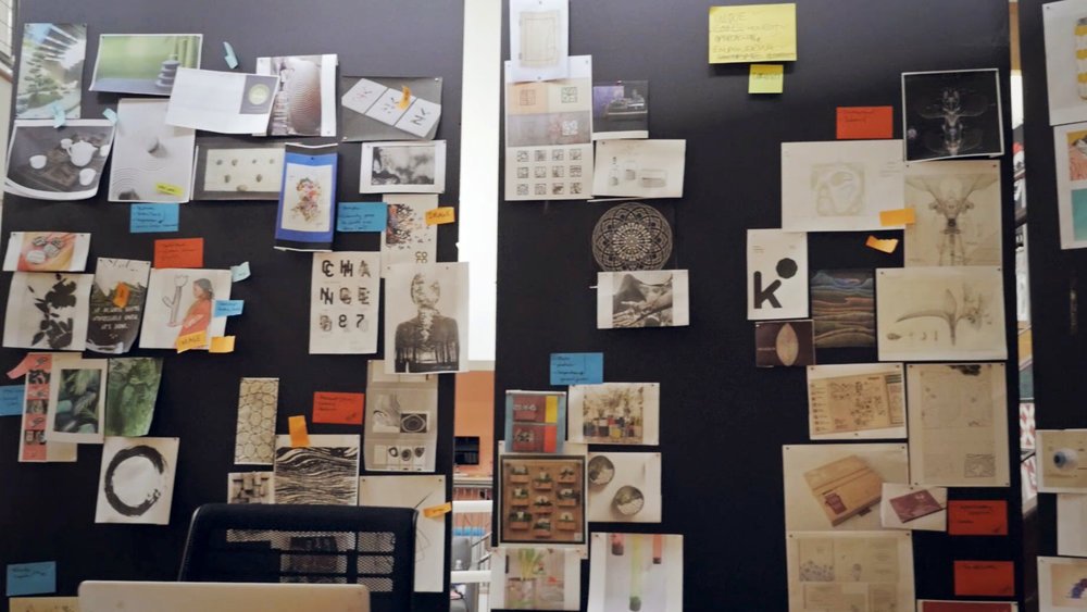
The first two weeks on the project designers were brought in for a design hackathon. I facilitated sessions around mission, vision, and brand values. We brainstormed product names, created moodboards, established brand guidelines, and began developing the logo. Those concepts were used to lock down an aesthetic directions and eventually, a full logotype.
Brand Guidelines
Outputs of the hackathon included brand guidelines; a full logotype, mark, variations, and a color system based on the card collection.
I designed an animation to elevate the Project Change brand story and introduce the final logotype to the rest of the company
Partnerships
We collaborated with a multimedia lifestyle brand, Yummertime, to create content for social—their visual sensibilities brought the card to life and positioned it in the world.
Marketing
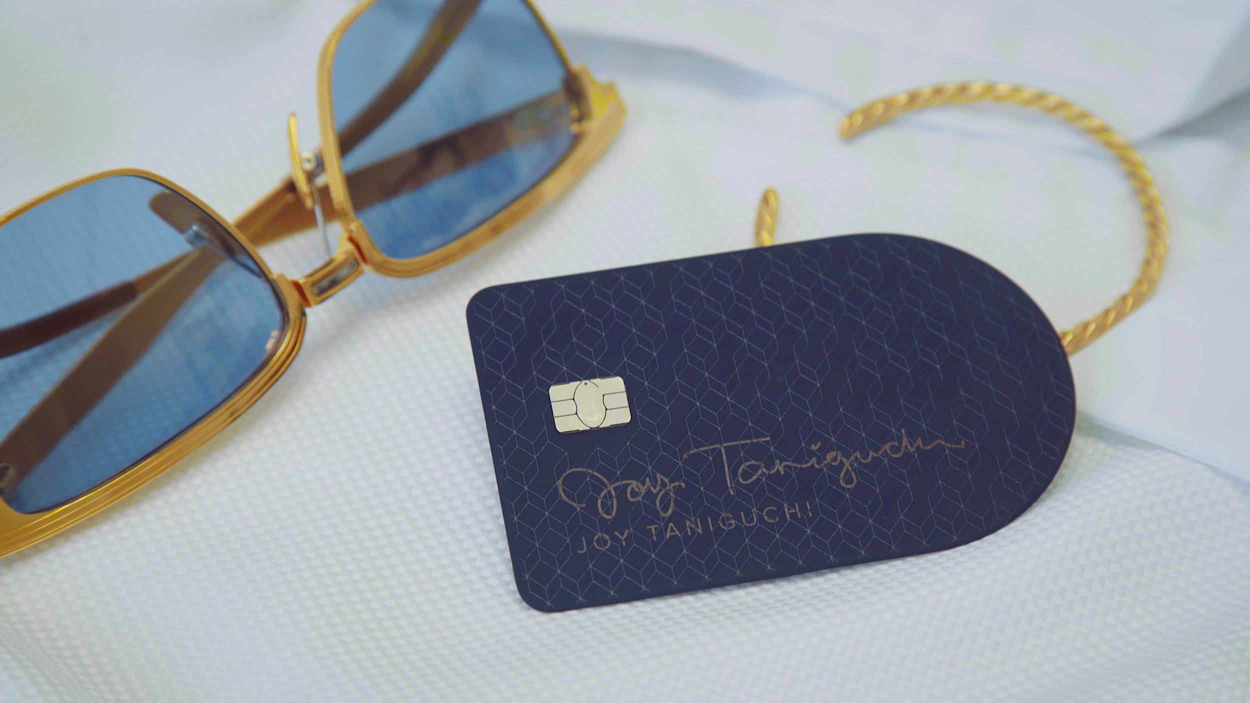
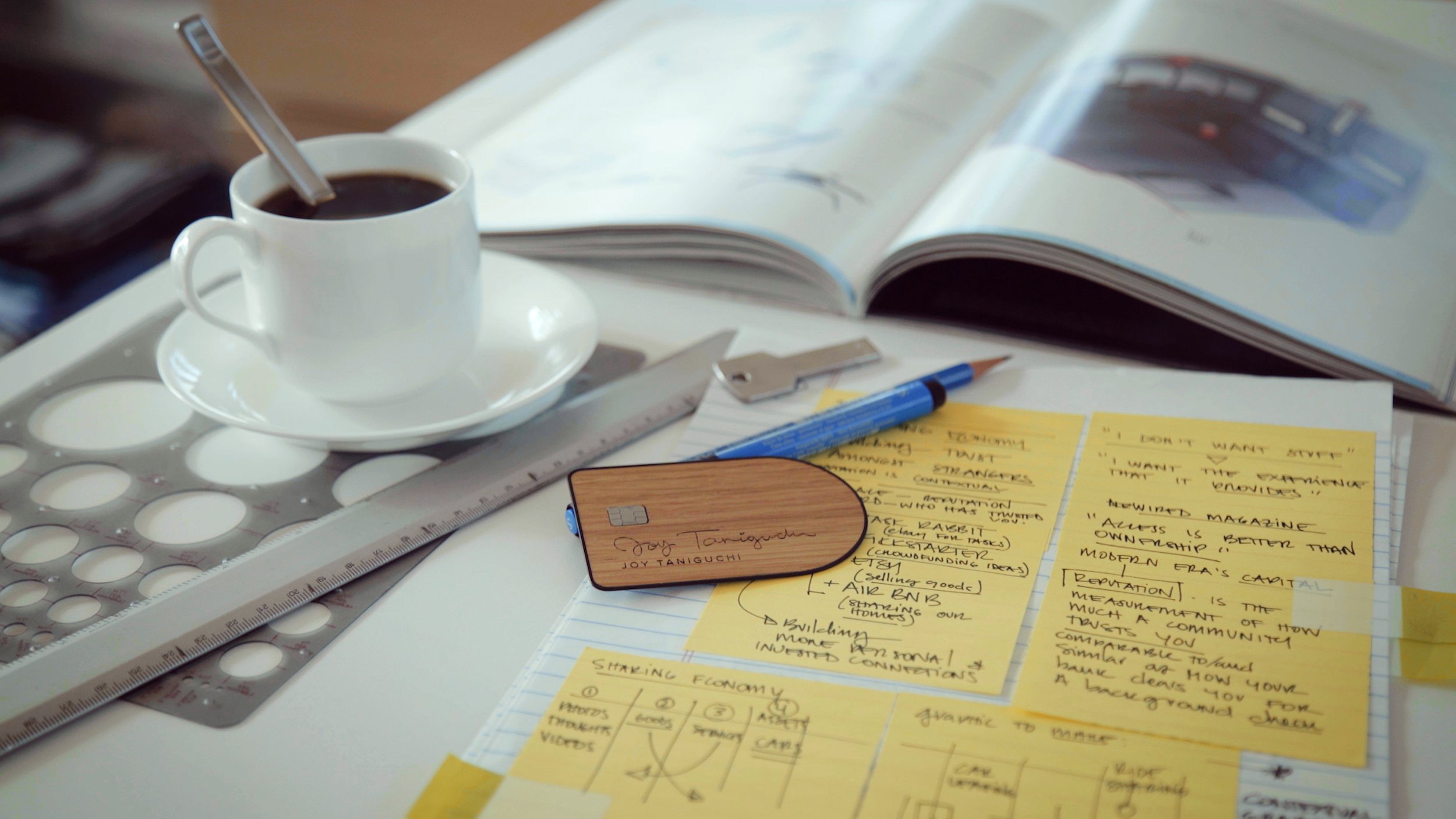
Additionally, we shot a series of lifestyle-product photos showing what ads and marketing campaigns might look like. Cards paired with places, people, and objects that spoke to their respective material story. The wood inlay card on the desk of an industrial designer, plastic yellow for a sunny day at the beach, navy (with a bespoke pattern) amongst fashion accessories.


Packaging
We wanted the packaging to surprise and delight customers by revealing the card in a more experiential, playful way. Below are mailer mock ups, color variants, packaging for an associate pilot, and physical prototypes...
The Elements Card
The card went to market (independent of the software component) and was rebranded to the Elements card leveraging the Project Change visual direction as it’s foundation. The logomark was slightly altered and applied to the existing web design mockups.
A storefront was created for the product launch at SXSW in 2017 based on the pop up experience we created in San Francisco a year earlier.


