X + O
Empowering teens to manage their finances
Role: Lead Designer
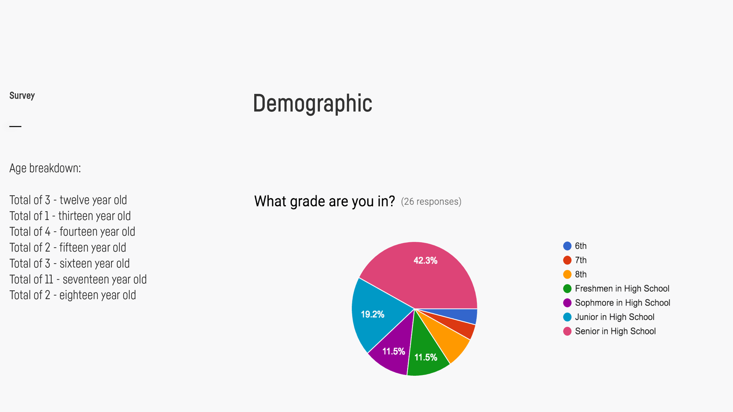
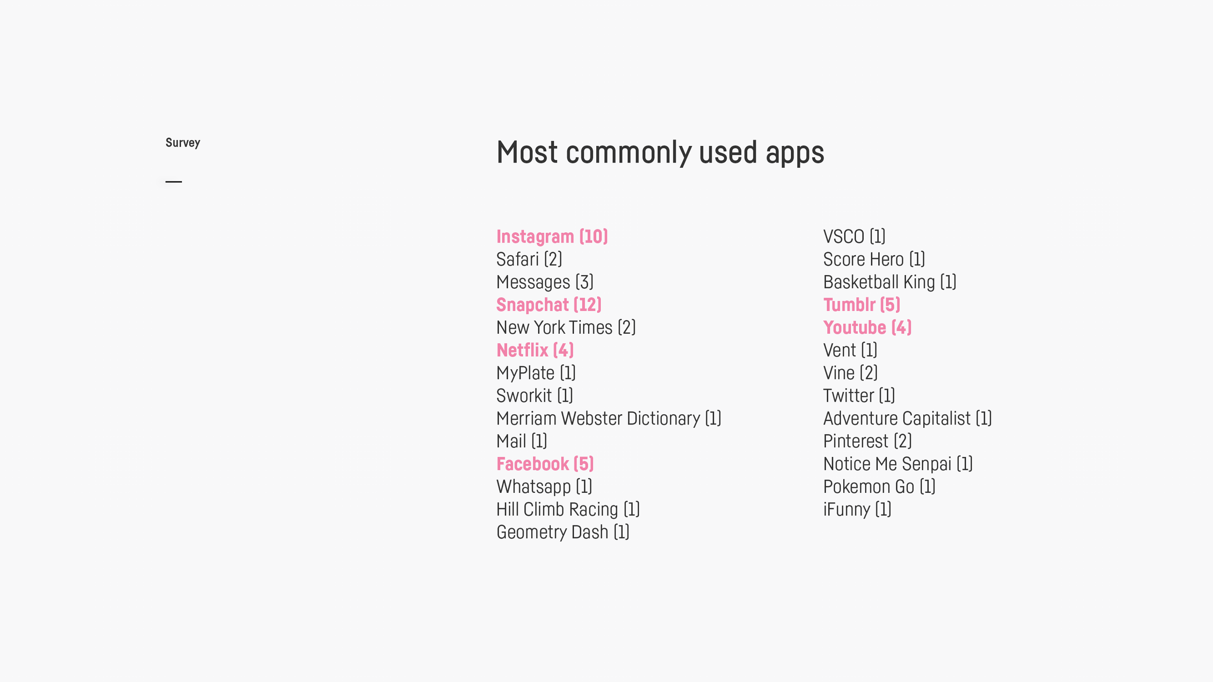
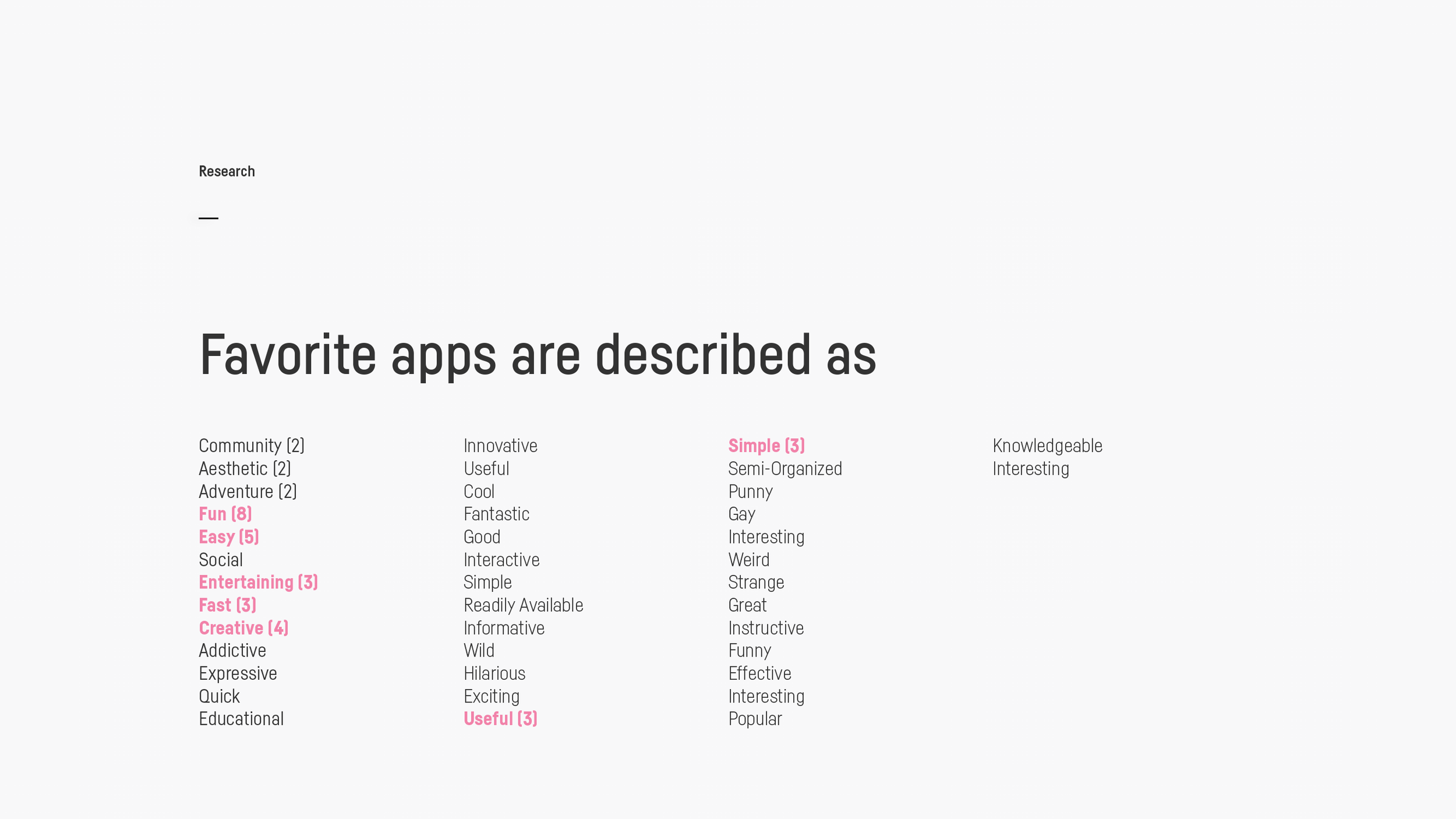
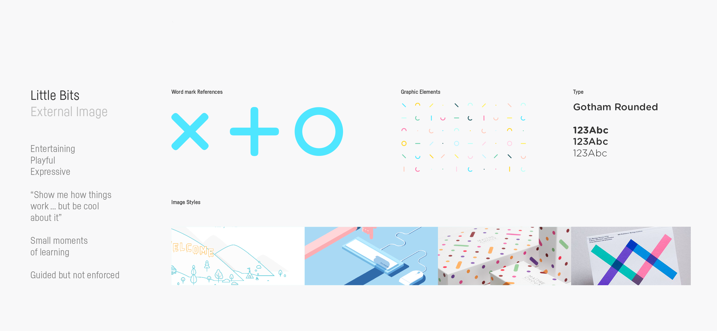
The project kicked off with a workshop to lock down the name of the app and the visual guidelines that would apply to both physical and digital touchpoints. The workshop was informed by a survey we ran with 26 teens ranging from 6th-12th grade to better understand their favorite apps, financial habits, and their preferred ways of learning. Participants also ranked popular apps in the market and their top 3 were collectively described as; social, easy, fun, expressive, useful, and informative.
We landed on X+O. It's visually playful while symbolically representing “hugs & kisses” commonly signed at the end of letters or text messages from loved ones.
Motion Study
A series of screen tests that brought the app to life with expressive and playful animations.
Card + App
Parents set the weekly allowance and interest rate with an option to post chores for additional earnings. Parents and kids share a view into card transactions and wishlists. We included a social element to the app where kids could see friends goals and wishlists. The app and card are both adorned by colorful, playful brand elements.
Microsite
We mocked up what a customer facing site would look like applying the same visual treatment with the addition of aspirational lifestyle photos.


