Side Projects
Concepts, Commissions, & Creative endeavors
I’ve maintained a regular fine art practice since college, frequently exploring new methods of making—applying these accumulated skills to projects outside the boundaries of my professional design work. Some of following projects are purely speculative, others are collaborative pursuits with friends & family.
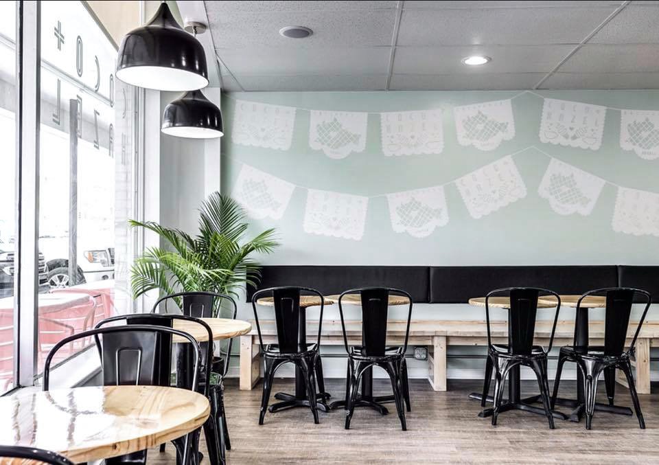
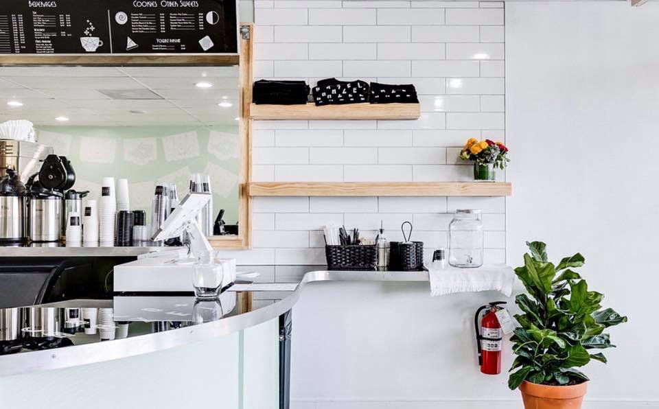
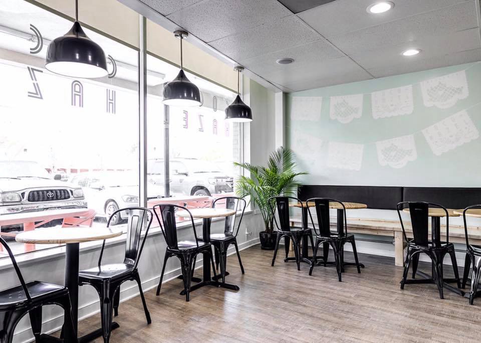
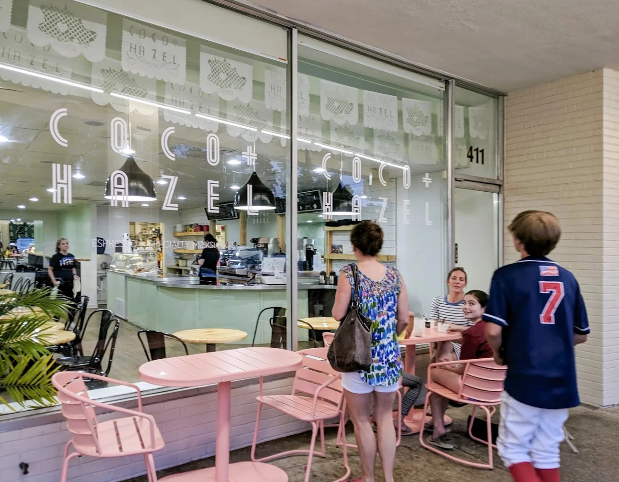
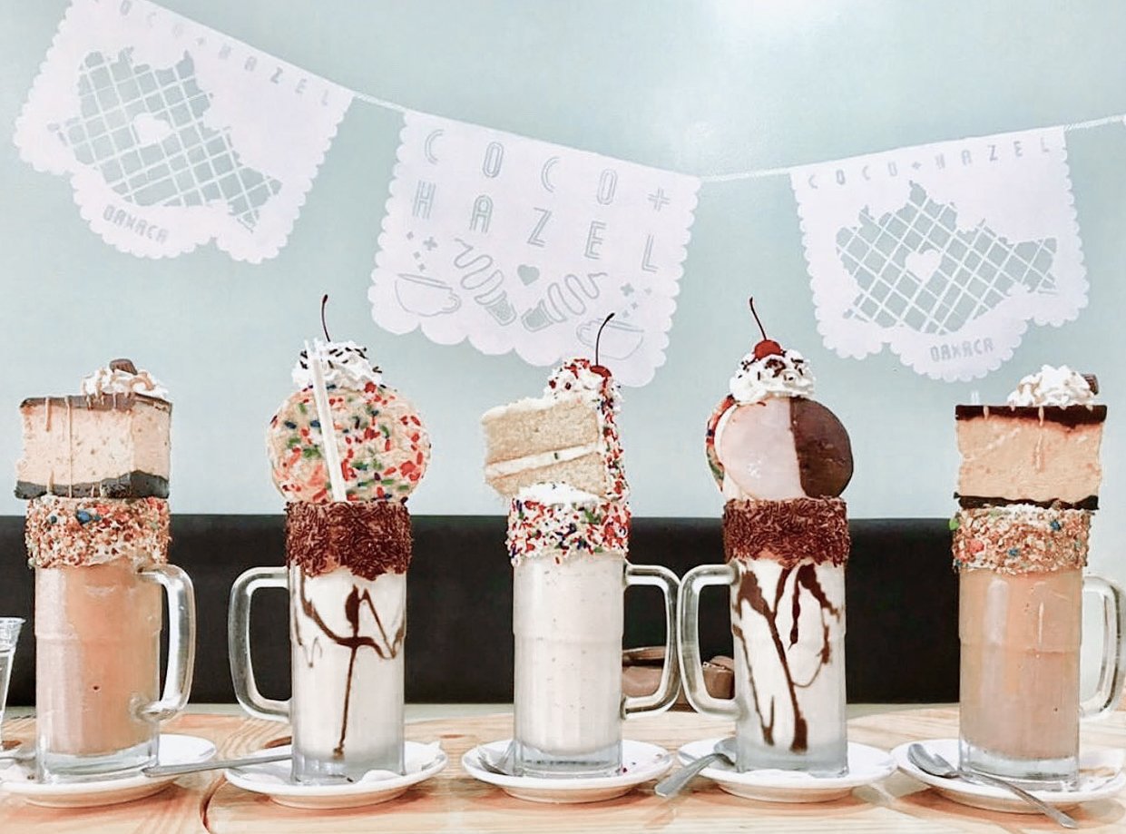
Coco & Hazel
An espresso and specialty milkshake shop in Richmond, Virginia. I teamed up with my brother, Kellor Wilson, to provide creative direction for physical elements in the space, logo exploration + final design, and graphics + lasercut stencils for the papel picado mural that spans the entire length of the shop.

Graphic + Motion Design
Over the years I’ve designed a range of static, 3D and animated visual assets to create compelling brand and product stories. Selections below.
Grace Hopper particle data viz
VCU's Hip Hop Student Collective
HHSC graphic applied to coaches jackets
'Gravel' glitch music video asset
Dichotomy logo revolve
'Angst' pendant
Physical Experience Design team logo
Clean Water Project fundraiser asset
Tacklebox official logo motion graphic
University of Maryland's machine learning incubator
Design in 5 installation animation
Peace by Piece graphics for 加藤 神也
Grace Hopper Environmental Animation
Capital One’s internal DataViz team built this model on a hybrid of threejs + D3. I applied animated elements to tell the story of how the company is using machine learning to fight fraud. It premiered on a giant multi sided LED screen above the Capital One space at Grace Hopper Conference in 2018.
Gray Matter Espionage
A creative partnership with my brother, Zirchi Gray; started as a blogspot in high school evolving into an art studio. We learned to screenprint, made cut & sew garments, built large format screens, and developed a range of products sold in stores and online. After linking up with our homies (who have since started Pizza Slice) we began throwing giant parties in Brooklyn and Shibuya with pop up shops, live painting, pizza (duh!), and live music.
Sculpture + Extended Media
A sculptural practice that twists digital artifacts with reworked mass produced goods. By re-contextualizing manufactured items into unique–handmade objects, we can then engage in a conversation around originality, reproduction, and consumption. All of which serve as themes in a body of work articulated through performance, neologisms, and installations frequently employing crude materials such as tar, plaster, and abandoned relics of a recent past.
NothingⓇ Community Edition Project
Collaboration with Janak Dadhaniya // Submission for Stage 3: Packaging Design
Combining the minimal brand ethos of Nothing® with the phosphorescent phone from Stage 1, we landed on a theme; Shadow Wall. A shadow wall is created when light flashes on an object in front of a phosphorescent screen, temporarily leaving behind the objects silhouette.


