UMD Tech Incubator
Creating space for the future
Role: Co-Lead + Experience Designer
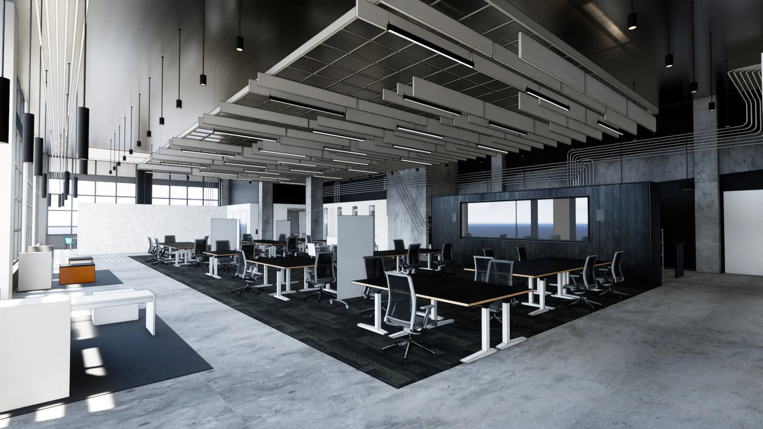
The incubator is a machine learning innovation hub at the center of the University of Maryland campus. It will be home to a handful of Capital One associates and 20-30 student interns per semester to work on Capital One business initiatives and drive research innovation. In collaboration with Capital One’s Center for Machine Learning and Workplace Solutions, we designed the look and feel of the space, as well as a feature wall - the main visual element in the space merging data visualization and physical design. The space is currently being used as an on-site workspace option as part of Capital One’s strategic approach to remote work.
Design Approach
We started from the perspective of the people working in the space. We identified key values and the tone and vibe to give the space an identity. As a result, we delivered impressive features in the space while meeting practical use requirements as a flex space for project work, speaker presentations, and workshops.
Key values “How the space should feel”
Collaborative - This a space designed specifically for co-working, fostering more interaction
Tech Forward- Shifting the perspective of C1 from stuffy bank to tech company to attract new talent
Flexible- An adaptable open workspace with mobile furniture that can be reconfigured to meet project needs, presentations, workshops, etc. maximizing the usability of and investment in a small space
Initial walkthrough of the empty space
Additional Design Elements
The muted grayscale colors of the incubator allow the space to be a backdrop for the students and associates to add their own color and character.
Our accent color: Magenta was selected because it is an “artificial” color. It does not exist within the spectrum of light, but rather as a construct of how our brains perceive a combination of red and blue light. This plays into the Artificial Intelligence and Machine Learning focus of the incubator.
Design pillars
Ownership - We wanted to create a space where the interns and associates that work in the incubator feel like it belongs to them. People are happier to spend more time in a place that is theirs.
Celebrate - The work being done in the incubator and the people that are doing it are important to Capital One, customers, and associates. The goal of this space is to elevate the people and their work, creating a stage or platform to share and celebrate that.
Axonometric view of the proposed layout
Concept rendering of the flex space
Tech Incubator
Logo by Scott Jemielity, Animation by Matthew Wilson
We designed the logo inspired by a mix of circuit board design and neural nodes. The animation evokes the movement of current through circuits alluding to electrical and neural circuits, illuminating the Tech Incubator literally and figuratively.
Transactions Visualization
by Erin Michet with support from Chris Hoffman, Alana Washington, Cheng Xu, Scott Ackerman, Matthew Wilson
This visualization was created with data from a single month of anonymized credit card transactions, and simulates a single multi-year cardholder account’s lifespan.
The Feature Wall
To further the space’s emphasis on machine learning as well as the theme of ownership, we designed and fabricated a feature wall. This installation includes content that we developed in partnership with the Data Visualization team and current UMD students. The content is intended to be updated by the residents of the space.
Concept Development
A top and front view of the feature wall with a few measurements to help establish a sense of scale. Below are two renders that show how the space dynamically changes throughout the day into night, shifting focus across various elements within the space.
Digital Content
The Feature Wall’s content adapts for event takeovers, student presentations, ambient evergreen content and custom data visualizations, creating an integrated digital platform to accent and compliment the flexible theme of the physical space.
A series of commissioned “palette cleanser” animations which tie into the physical form of the wall create transitions and continuity between otherwise disparate content elements.
Particle Visualization
by Erin Michet and Cheng Xu
This was created to be an ambient visualization, subtle and abstract to not distract the people working in the space. It is intended as an inspiration/experiential and show a variety of visualization techniques in contrast with other visualizations on the feature wall.
Game of Life: Redux
by Cheng Xu and Janak Dadhaniya
The visualization is a stylized version of Conway’s Game of Life. The Game of Life is an example of a cellular automata which has been theorized as a way to solve for artificial intelligence. The tiled structure of this visualization was inspired by the UMD Tech Incubator logo.
Palette Cleansers
by Where The Buffalo Roam
Worked with the amazing team over at WTBR to design a series of fun palette cleaners to transition between and unify otherwise disparate content by establishing a global visual language.
Additional Animations: wtbr.tv
Architectural Support: gensler.com
Construction: turnerconstruction.com


